How to Make a Small Extension Feel Bigger
Garden in a Room

It's easy to assume that transforming a home means adding more space. In our experience, that's often the wrong place to start.
The homes that transform everyday life aren't always those with the biggest budgets or the largest extensions. They're the ones where every square metre works harder - where careful design makes a home feel more generous, more connected and ultimately more enjoyable to live in. This becomes especially important when a site is constrained, the budget is limited, or an existing building demands a more thoughtful response.
Rather than asking: How much can we add?
We ask a different question:
How can we make a home feel larger without making it much bigger?
‘Garden in a Room’ is one such recent project where we had to tackle this very question. It grew from a modest commission to replace an ageing lean-to extension attached to a compact Grade II listed house in Wiltshire. The existing extension had gradually become the weakest part of the home. It was thermally inefficient, disconnected the kitchen from the courtyard garden and left the centre of the house feeling dark despite the garden sitting only a few metres away.
The obvious solution would have been to build larger.
Instead we explored whether a relatively modest intervention could fundamentally change the experience of the house.
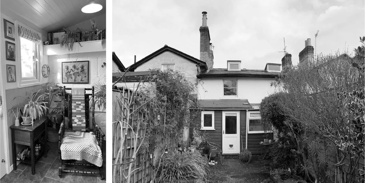
As shown here the existing listed property in Trowbridge was restricted by a compact rear structure that desperately needed replacing with something that would tackle their space problem, finding creating ways to achieve this without adding much more floor area.
Don’t think bigger. Think more connected.
In these situations thinking intelligently about how external garden space can be made to feel like a true extension of the internal space will create opportunities for a greater sense of openness and space beyond the physical walls. A focused effort on removing boundaries between inside and outside goes beyond merely installing bi-fold doors.
We like to think about how internal floor levels and surface treatments cross the threshold to create greater visual continuity and work to draw the eye outward. The careful positioning of windows used to capture views out from deeper within the building plan (or when entering into an adjoining room) can be used effectively to engrain a stronger relationship with the landscape from an earlier moment in the journey through your building.
These curated moments also develop a stronger awareness of the outside, and the thoughtful placement of windows and rooflights will serve to connect your spaces with natural light at the right times of day to activate a space, with rooflights especially effective at fostering a stronger connection with the sky and tonal shifts brought about by clouds and time passing. When we're constantly aware of the sky, weather and garden beyond, the room begins to feel connected to something much larger than its physical footprint.

The strategic placement of windows in your space can be used to frame curated moments in the landscape as an effective tool for drawing the eye and mind beyond the confines of space and lending a greater overall perception of openness. This photo was taken from our Beach House Project which showcases efficient space planning on a whole building scale and uses thoughtful framing of views to open out the interiors.
Considering Garden in a Room with its deep narrow plan form trapping the kitchen away from any external wall and windows, it was particularly important to position the rooflights where they would allow light deeper into the plan introducing movement, shadow play, and glimpses of sky into the heart of the kitchen - reinforcing a subtle but constant connection to the unbounded space outside.
The goal here wasn't to erase the boundary between house and garden, only to make that boundary feel less abrupt.
By borrowing light, extending views and allowing materials to continue across thresholds, the garden begins to feel like part of the daily life of the house long before you step outside.
Architectural section showing how bespoke joinery links the original kitchen to the new garden extension, with a rooflight positioned above the threshold. Carefully considered sections and rooflight placement bring natural light deep into the floor plan, helping smaller rear extensions feel brighter, more spacious, and better connected to the rest of the home.
Great spaces flow, not just function.
Ensuring there is sufficient space to comfortably move around and live in a space may sound fairly obvious, but in smaller more compact living spaces this becomes a critical success factor and is easily overlooked in many extension and renovation projects.
Getting this flow and movement right, and understanding the minimum space requirements for use of a room as intended, can be the difference between a home that is a pure joy to life in, versus one that feels cramped and awkward. Proper consideration of this invisible character and dynamic of a space is essential to getting real value for your investment when developing a property.
For our compact Grade II Listed house in Wiltshire, the obvious starting point was to create a larger central doorway between the kitchen and the new rear extension. However, once tested against the optimum use of kitchen and storage space, the design evolved around a transverse route instead.
This single shift in circulation proved far more successful. It improved the flow between spaces, offered a teasing glimpse of the garden before the full reveal, eliminated dead ends and bottlenecks around appliances, and created a much richer sense of journey through the home.
Good circulation isn't only about moving efficiently through a house. It's about anticipating the countless small routines that make up everyday life - from carrying shopping in from the car, to making a morning coffee, to gathering around the table with family and friends.
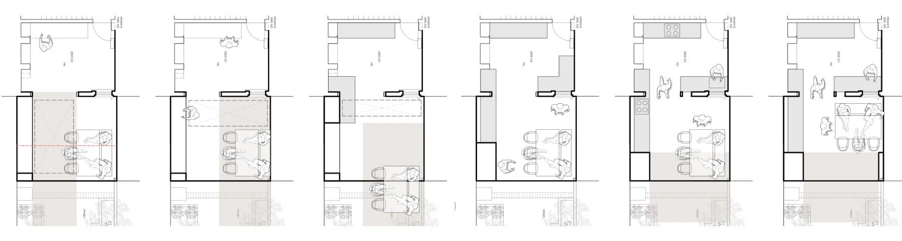

Design evolution exploring alternative floor plan layouts to refine circulation, maximise storage, and strengthen the connection to the garden. By testing different arrangements, the final plan creates a more generous sense of movement and links two compact spaces into one cohesive zone, allowing both to feel larger than their footprint suggests.

Creating Movement
Another of our favourite reasons for the offset access created through our extension, was in the way the plan unfolds gradually, much like the unfurling frond of a fern, revealing the extension and garden a little at a time rather than all at once. With this arrangement your eye is constantly being pulled between the spaces, and rewarded with longer garden views, so you no longer perceive strong walls and divisions, instead you're able to explore and invited to escape to outside.
Making every element work harder
One of the biggest mistakes in small extensions is thinking that every element should perform just one function.
In larger homes it's easy to dedicate space to circulation, storage or display. In compact homes, every element needs to work much harder. A single piece of joinery might store everyday clutter, define the boundary between two rooms, frame a view to the garden and guide movement through the house - all at the same time.
When every element contributes in several ways, the home begins to feel far more generous than its footprint suggests.
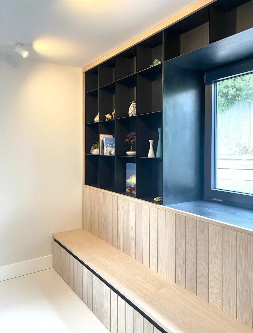
A carefully designed piece of joinery can
hide everyday clutter
connect adjoining spaces
frame views through the home
guide movement
bring natural light deeper into the plan
create character and identity
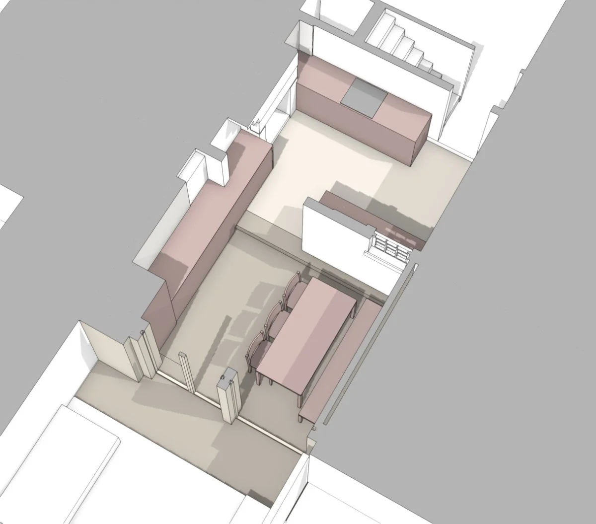
For Garden in a Room, bespoke joinery became one of the key architectural devices that allowed the extension to achieve far more than simply adding storage. Rather than treating the kitchen and dining room as separate spaces connected by a doorway, we used fitted furniture to physically stitch the rooms together. The joinery wraps around the existing chimney breast so that it reads as one continuous architectural element rather than a collection of individual cupboards.
The effect is surprisingly powerful. Because your eye reads the furniture as one continuous piece, the rooms begin to feel connected long before you walk between them.
Of course, the joinery also performs the practical tasks every home demands. It conceals appliances, coats, shoes and everyday clutter, while providing generous kitchen storage exactly where it's needed. By removing visual noise from the room, the eye is free to appreciate the proportions of the space, the changing quality of daylight and the longer views through to the garden.
In this way, the storage isn't simply practical - it actively contributes to making the house feel calmer and more spacious.
Open shelving then allows the homeowners to layer their own personality back into the space. Books, ceramics, artwork and objects collected over time become part of the architecture, bringing warmth and identity without overwhelming the room.
Positioned beneath the rooflights, these displays change throughout the day as sunlight moves across them, adding shadow, texture and subtle movement that reinforces the connection with the garden beyond.
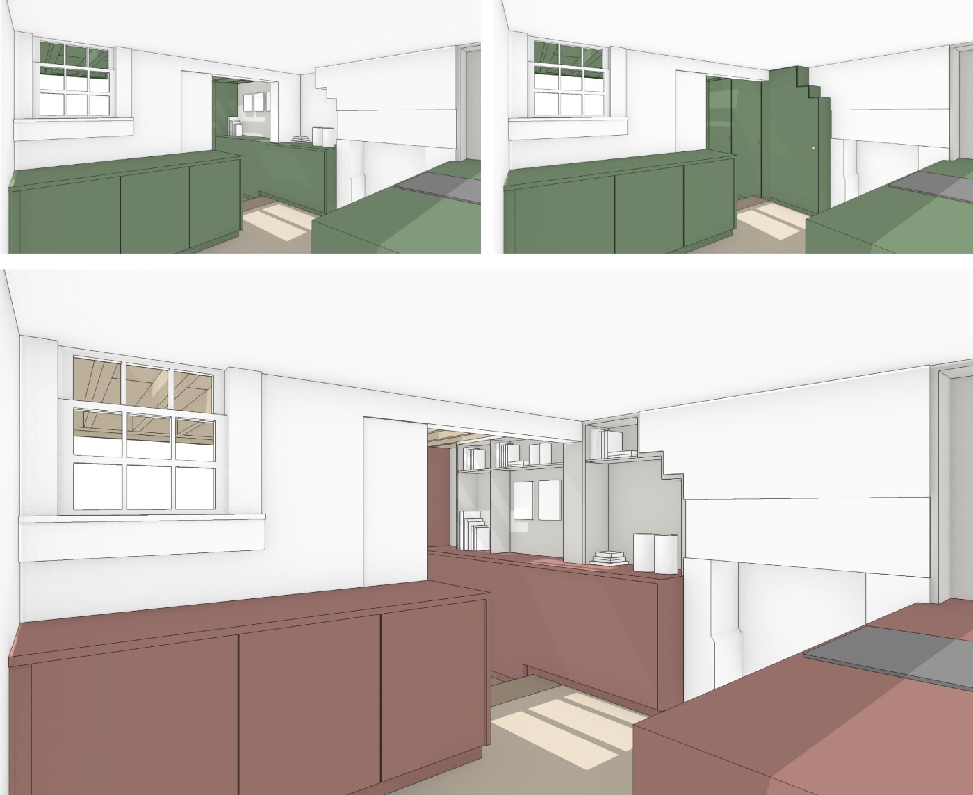
Bespoke joinery can do more than hide everyday clutter. By visually stitching adjoining rooms together, it creates a stronger sense of continuity, helping compact spaces feel larger and more connected. We use 3D modelling to test different ideas and refine the solution that best enhances the perception of space.
Small changes can have the biggest impact
One of the most common assumptions in residential design is that making a room feel more spacious simply means making it bigger…or taller.
In reality, comfort is often less about absolute dimensions than how we experience them.
Rather than asking ‘how can we make this room taller’, we prefer to ask:
How tall does it actually need to be to feel comfortable?
That distinction changes the way you approach a project.
For Garden in a Room, we were working with an older listed house where ceiling heights were already lower than those found in most modern homes. Trying to create a much taller extension would have introduced unnecessary cost and complexity while feeling out of place alongside the existing house. Instead, we looked for smaller interventions that could subtly change the perception of space.
A single step down into the extension immediately increased headroom while marking the transition between house and garden. Exposing the roof structure added a little more vertical breathing room, while the rhythm of the timber joists naturally draws your eye towards the garden beyond.
None of these decisions, taken individually, are dramatic. Together, however, they fundamentally change how the room is experienced. The space feels lighter, more generous and more connected to the landscape outside - not because it is significantly larger, but because every design decision is working towards the same goal.
So imagine: Sitting at the dining table, you no longer become aware of the ceiling pressing down above you. Instead, your eye follows the exposed timber structure towards the garden and the changing light beyond. The room feels more open, despite barely gaining any additional height.
Arriving at these decisions wasn't a matter of instinct alone. Throughout the design process we tested numerous alternatives using 3D sketches and digital models, allowing us to compare how subtle changes to ceiling height, joinery, rooflights and circulation altered the experience of the space before a single brick would be laid. Often the smallest adjustments proved to have the greatest impact.
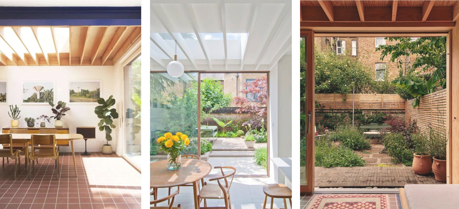
When every millimetre counts, subtle changes in floor level and exposed roof structure can make a compact space feel more generous. Drawing the eye upwards and outwards, while continuing the same stone flooring into the garden, this blurs the boundary between inside and out to create a greater sense of space. These precedent projects are a great example of just this.
In Conclusion: Bigger isn’t always better
Perhaps the most valuable lesson from this project is that spaciousness is not a product of scale but of perception.
We can't always change the physical constraints of a site. We can, however, transform the way a home is experienced through careful decisions about light, movement, proportion, views and the relationship between inside and outside.
Good architecture doesn't begin by asking how much can be built.
It begins by asking how people want to live.
Sometimes that leads to larger extensions. Sometimes it reveals that a relatively modest intervention, carefully considered, can have a far greater impact than its size would ever suggest.
In the end, the best homes aren't necessarily the biggest. They're the ones where every element has been designed to work a little harder.
Thank you for reading.